The Kost style guide

Colours

Studio

Capital

These are the colours that define the Kost website.

Yellow

For backgrounds, buttons and highlights.

#FCF1A2

Dark Blue

For combination with Primary Yellow and for text and accents.

#11253D

Soft Grey

For text on a light background. Transparency is preferred for blending. The Alt non-transparent option is the equivalent of a white background.

#000000 @50%
Alt: #8A8A8A

Full White

For text on a dark background. Alt is used for a soft blend and is used for the logo in the footer.

#FFFFFF
Alt: #FFFFFF @80%

Icons

We use Phosphor Icons for all your iconography. They can be individually downloaded from the Phosphor website or as a plugin for most design programs.

Look and Feel

Use these settings to maintain the look of the website across all your branded Kost assets.
Cards and images should have a border radius of 10px.
Cards placed on images should also have
  • Background: #000000 @20%

  • Full white text colour

  • Background blur = 10

  • Shadows: X=0, Y=2, Spread=8

Cards and images should have a border radius of 10px.
Cards placed on images should also have
  • Background: #000000 @20%

  • Full white text colour

  • Background blur = 10

  • Shadows: X=0, Y=2, Spread=8

Cards and images should have a border radius of 10px.
Cards placed on images should also have
  • Background: #000000 @20%

  • Full white text colour

  • Background blur = 10

  • Shadows: X=0, Y=2, Spread=8

Typography

Your text styles are straightforward, using one text with little variation aside from in the logo.

Manrope

The main text used almost exclusively throughout the website.

Regular weight is used for most instances. Semibold weight is used for notes or to highlight text.

Use a letter spacing of -0.04em or 4% for headings.

Use a letter spacing of -0.02em or 2% for body text or headings lower than 18px.
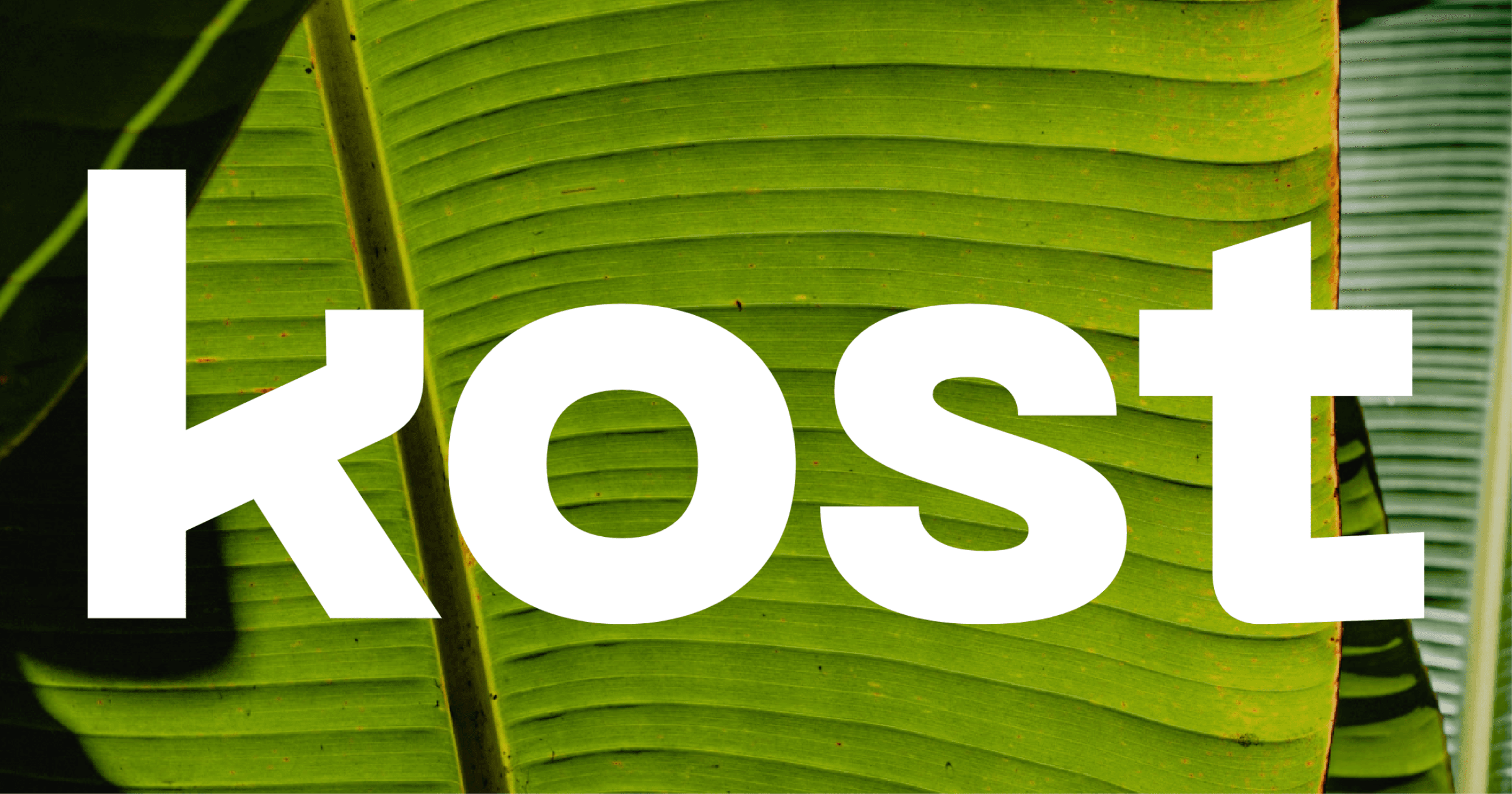
PP Neue Machina

The text style used exclusively for the logo.

Always used as lowercase.

The kost text is in ultrabold and has a standard letter spacing.

The regular capital/studio text has a letter spacing of -0.04em or 4%

Images and Videos

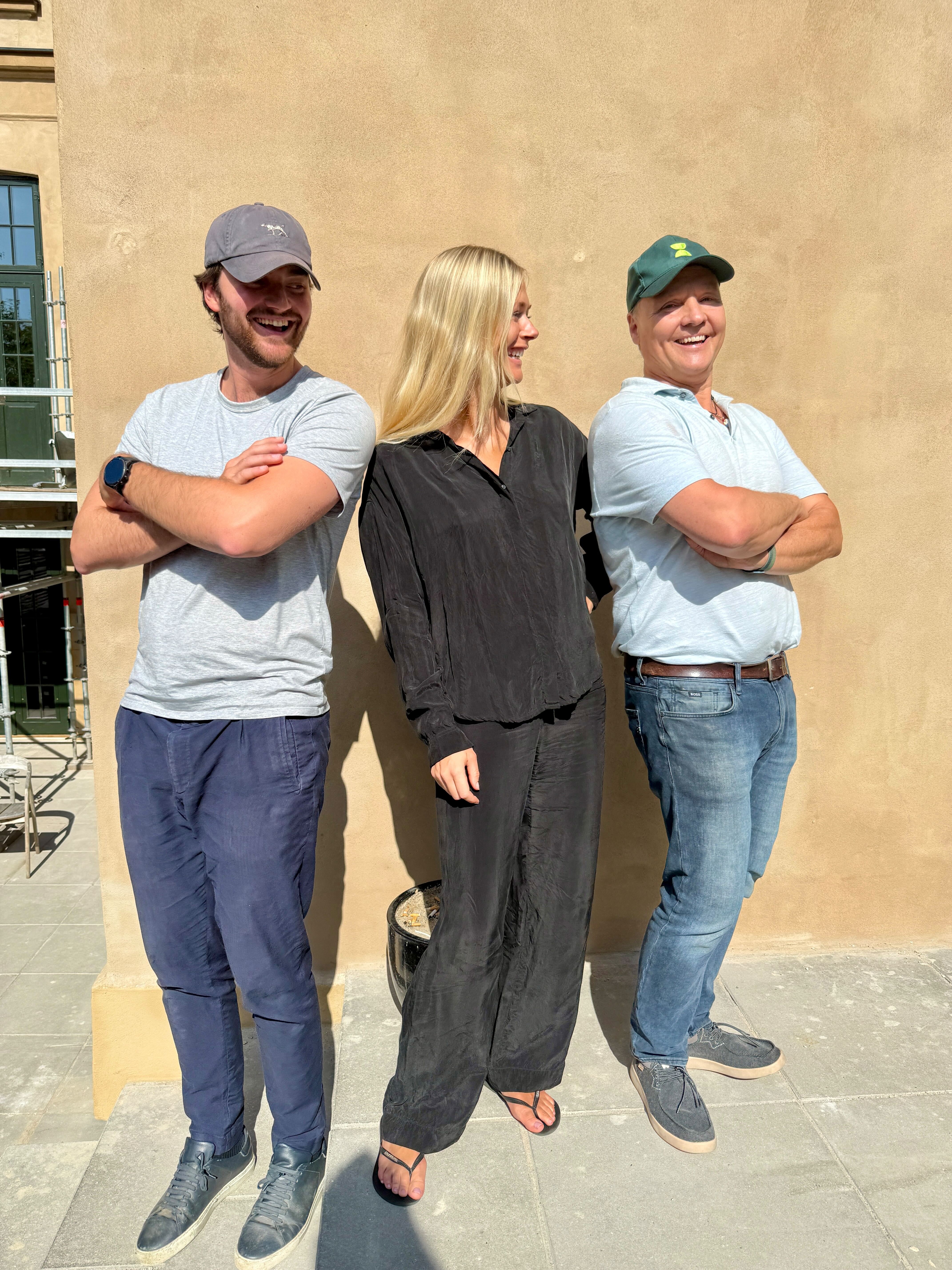
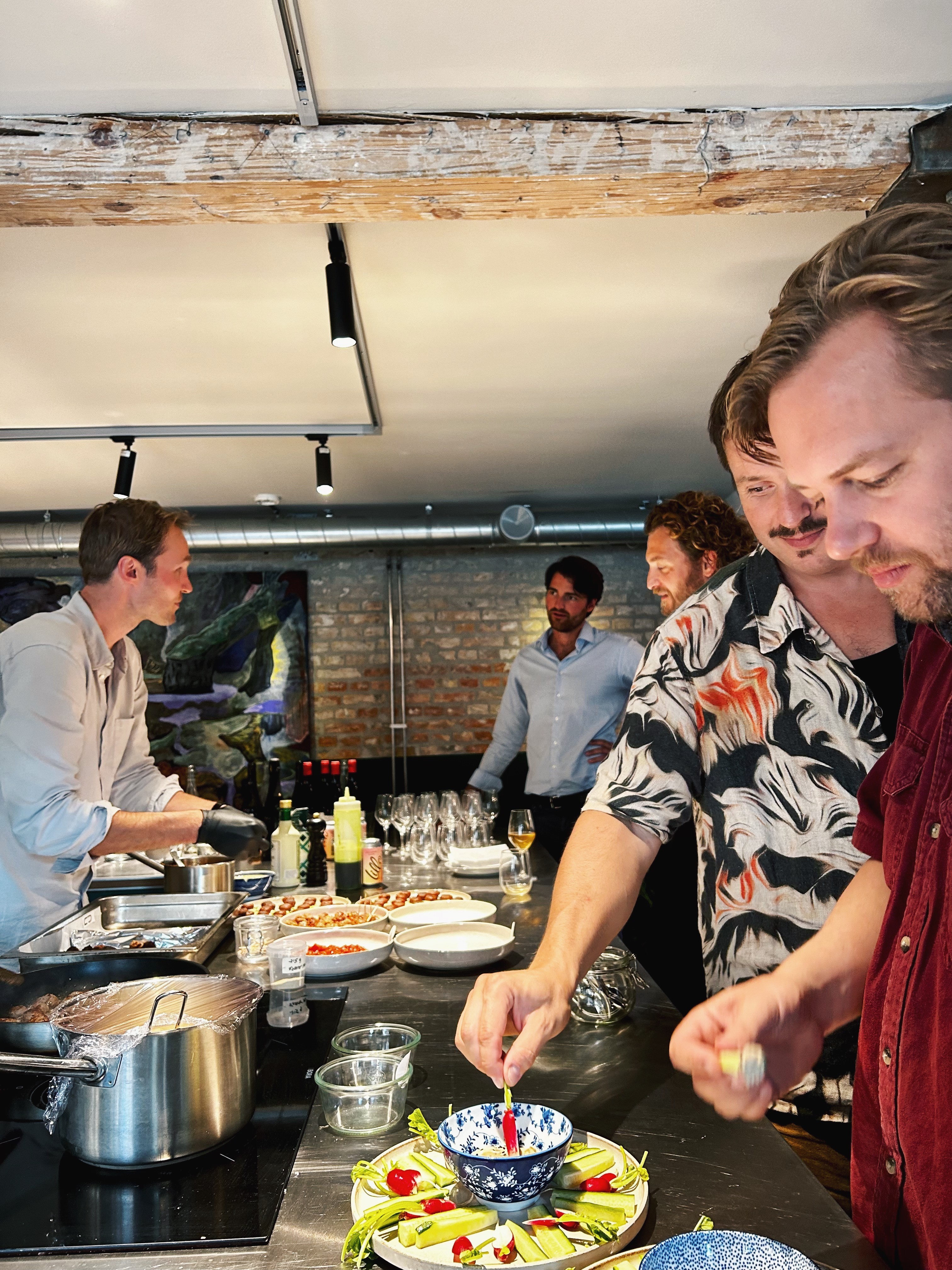
Most of the images and videos we have used on your website are from Death to Stock. You may require a license to display them.

All your assets are available to download and reuse in the Repository section of your Skarlo Notion design board.